Pages

Wednesday, 20 October 2010

Especially dedicated to the Plagiarists and Copycats out there! :)


Please don't copy our posts... we work hard for them... Thank You :)

Visual Narrative: Brunei Tourism (Wk7 tutorial)

ENJOY!

 
 Brunei, the Green Heart of Borneo


Brunei Darussalam, a Heritage
These two tourist commercials are promoting Brunei Tourism for the whole world to see. Each of these tourism commercials are different from each other but some of the elements are similar to each other. As you can see from their titles, they are both very contrasting videos. 'The Green Heart of Borneo' video shows more of Brunei's greener side and the 'Brunei Darussalam, a Heritage' shows more of Brunei's regalia, the country's heirlooms and Brunei history.  

The difference between the narratives of the videos is more to its visual aspects (pictorial). If you watch the videos, The Green Heart of Borneo shows more of Brunei's culture such as the people, the villages, the Kampung Ayer and also Brunei's flora and fauna whereas 'Brunei Darussalam, a heritage' shows more of its royal regalia and basically Brunei's wealth. If you compare the time duration of the videos, the first video which is the 'Heart of Borneo' is much longer than the second video which is the 'Brunei Darussalam, a heritage'. This proves that the first video shows more of Brunei than the second video. The second video has shorter time duration because it only wants the viewers to see part of its tourist attractions which is the Brunei heritage. The first video, on the other hand, shows most part of Brunei such as the people (culture) and the flora and fauna.

Moreover, the visual narrative is being assisted by the written narrative to somehow emphasized the attraction and to allow the audience to soak up the words in their minds and 'hink  It is not unusual for tourist commercial to use flowery words in order to attract people thus these videos have used several soothing and attractive words which mostly trying to suit the pictures such as 'golden' and 'glittery' which matches with Brunei's mosque, the golden pots and pans and the golden threads of the 'songkets' or 'jongsarat'. They also use words like 'local, faith, ceremony, treasures' these are words that shows what Brunei have such as the Islamic religion, the people and the ceremonies such as weddings. Overall, these words are carefully chosen in order to make viewers to 'feel' and ' think' that Brunei is what the video is trying to make them think which is beautiful, unique and filled with wonders. 

Furthermore, the background music also adds up to the attractions which emphasizes its uniqueness because the music is being played by a particular instrument such as 'gulingtangan' which can only be found in certain parts of Asia including Brunei. This makes other people who are not familiar with the instrument to be fascinated to such unique sound. 

Sunday, 17 October 2010

Narrative (Architectural Designs): The Little Girl's Bedroom (Wk 7)

What is more interesting to narrate about other than a little girl's bedroom?


I have found this amazing bedrooms just by googling 'the little girl's bedroom' and all these expensive, magical fairytale-like bedrooms pop on my screen and I literally gasped and screamed thinking 'how I wish I can be this spoilt sometimes when I was younger'.

Imagine that you walk your way to your niece or your friend or your sister's daughter's bedroom and when you open the door and suddenly you are in Disney's Cinderella's world? It is amazing how these designers could actually make the phrase 'fairytales do exist' come true. This was made by Mark Wilkinson Furniture in London for a soccer star. Mr Wilkinson refused to give the names of his clients but he only tells the reporter that his client is a soccer player. Perhaps a very wealthy soccer player because this bedroom costs a whopping $99,000 US dollars! 

Thus we can see that a bedroom can tell us a story. For example these bedrooms tell us one of the fairytale stories we know of such as Cinderella, Goldilocks and the Three Bears, Rapunzel and Sleeping Beauty which all come from the Disney Fairytale movies. Anyone who have watched some of the fairytale movies would recognize the designs in the bedrooms such as the round horse carriage which we have seen in Disney's Cinderella movie.


A short 'trailer' of the Disney's classic Cinderella movie will play in our mind as soon as we see the horse carriage, the castle and the little crown shapes. It also tells us a story of how the little girl herself loves the movie so much that she would have persuaded her parents to design a Cinderella theme for her room. This also tells us a story about the little girl's personality. We know that not all children have the same personalities so this bedroom could tell us that the little girl love to watch fairytale movies and also to want to have a life like the princesses she have watched.

This does not always occur to children but adults too. Our own personal spaces could tell our personality and this have proven by some researchers. Bedrooms, offices, bathrooms which are very personal to us could tell whether we are an extrovert or introvert, or that we are the 'messy' type or a perfectionist. Just by looking how we organize our bed, computer and even our wardrobes tell a lot about who we are. 


From each of these rooms we can tell what kind of person that owner is. He or she could be a clean or a messy person. We could also tell if that person is an organized person or not just by looking how he or she decorate her place or how she organize her toiletries, books and even how he or she folds their bedsheets. Thus personal spaces could tell us a story of an individual or even perhaps tell us the life of that individual because all those designs come from our own preferences meaning our ideal way on having such a space that suits our comfort which somehow preserves that personality of ours.


References:

http://www.articlesbase.com/interior-design-articles/bedroom-decorating-style-show-your-personality-768296.html
http://www.decoratingstudio.com/articles_consumer_info/color_personality.html
http://www.utexas.edu/features/archive/2002/spaces.html
http://www.bornrich.org/entry/soccer-offsprings-sleep-in-a-99000-enchanted-world/

Sunday, 12 September 2010

Week 5: Tutorial Task: Fire Safety For Children

Topic Question: You are asked to provide a presentation to a group of children between the ages of 8-10 years old. Your topic is about fire safety and how to prevent fire accidents in the home. The context of this presentation is in Primary school.

If I were to teach children about fire safety, I would show them a real fire!


I would take out a lighter and light it. Some people would show them a cartoon or animated fire with mean faces usually because in order not to scare them or they think that the children would remember easily if it were a cute animated fire but I do not think so. In my opinion, it is better to show them the real thing so they know how the fire really look like. Real fire do not have mean faces and iconic in reall life right? What I am saying is that, be realistic. I am sure that they already have this image in their schema for fire. Children are very curious at their age and I assume that they acknowledge fire even before they enroll in a school, perhaps from the stove where their mother cook their breakfast or the bonfires their father made during their camping trip or in their PSP, PS3 or any visual games that they play. Some might say that I could just show them a picture of a real fire but I prefer showing them live because children are more attentive and fascinated to interactive things.

After showing them the first schema, I would go on with my explanation of what a fire is and what it is capable of. Then I will show them the next schema:-


I know this might look slightly gory for primary students but I think it is the best way. Besides, they are primary children and they are old enough to see such image. If I were a parent myself, I would show them this because at least they know that this is a serious matter that they need to be aware of. Moreover, this image would heighten that negative effect of playing with fire at home.

The top level of the schema is that the fire is always hot and burning and the lower level of the schema would be the fact that it can cause serious problems which might be dangerous for them if they do not handle it with care. Both of the schemas are congruent because both of them are things that we see in our everyday life.

Thursday, 2 September 2010

Semiotic & Rhetoric: Chanel vs Dolce&Gabbana (Wk 3, 4 & 6)

When you look through the ads, I am sure that you can identify the differences. I, myself, realized that what had been presented by Dr Chris in the lecture about Coco Chanel and the Dolce&Gabbana ad had struck me to point this out. The Chanel brand was actually a name from a legendary woman named Coco Chanel who made history by making women fashion clothing while Dolce&Gabbana's designers are actually men which explain their masculine and rather sexist ads. If you examine closely, they make a perfect comparison!

In visual communication, it is the time where you analyse ads critically and I did. I have looked over ads from Chanel and Dolce&Gabbana and there are differences. The Chanel ads show more women than men while the Dolce&Gabbana ads show more men than women. If we knew about the history of Chanel, it is clear why they put more women than men in their ads. The ads mostly reflects on women because that is what Chanel is all about. It is about femininity.

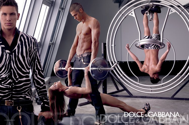
The Dolce&Gabbana ads however are very masculine and male-dominated since they show more men and less women. If you look through their ads, most of them have more than one men in an ad. This is very significant because the designers are male. I am not saying that because the designers are men, the ads show more masculinity stereotypically. Some male designers do design more fashion for women than men such as Emilio Valentino and the late Gianni Versace. Yet this is just an assumption. It is possible that they represent more masculinity than femininity in their ads because the designers are men. I could be wrong but there are possibility because if you observe closely through their ads, especially the ones that have both men and women together, the men are mostly being focused on compare to women. They are always posed upright, bold, fit and muscular, mostly emphasizing their physique while adorn them with their expensive fabric. The women however, are always in a very awkward positions such as these:-

However, there is always a story to tell in each of the ads but I am not going to elaborate on that, it is up to you to interpret it. Again I am not saying that all of the ads show women in such manner, but most of them do. All these could be a significant to the fact that the designers are male and that they prefer to appeal more to their sex than the opposite sex.

Another question you might want to consider when you analyse Dolce&Gabbana ads, is that 'Do you realize that you tend to look more onto their models and story of the ads than the products they are trying to promote?' because I did. I realized that I forgot about the products they are trying to promote because I am focusing more on what the ads are trying to say. However, this is because we are taught to do for being a professional visual communication students but if we are just those people who just wants to buy fashionable clothes, they might interpret what the ads are trying to say but that is just it and then they shift their thoughts, will they really look 'sexy' in that outfit? or will they attract as much opposite sex as what the ad is showing?'

It seems that the representation of the ad is much more emphasized than the products. We could put this into thought that they actually promoting their brand name. Nowadays, fashionable people usually buy things because of their brands regardless if it is a bag, shoes or accessories. It shows distinction if you buy certain brands. Sometimes you hear people saying 'This is not just a bag, it's Prada" quoted from a movie called 'White Chicks' and another one quoted from a movie called 'The Leap Year", a man ask a woman "This bag looks expensive, why would your fiance bought you a bag? Isn't that weird?' and the woman says 'It's... Louis Vuitton..' meaning it is not just an ordinary bag but it is an expensive designer bag and it means that the name itself IS the product! The items somehow is just a medium in order for them to promote their brand names instead. However, this only happens if the brand has developed reputation and popularity because people already acknowledged their brand names.

As mentioned by McQuarrie and Philips (2008), Go Figure! New Directions in Advertising Rhetoric:-

a) Rhetoric in advertising more concerned with style than
content.
b) Advertising rhetoric more interested in how to say
something as much as what to say.
c) Advertising style is not new. Since antiquity, there are
different rhetorical styles: rhyme, anaphora, antithesis or
synthesis (p.5).
d) Advertising style consists of the medium, genre,
strategies of production and creative imageries to show
an argument.

So it has proven that advertisement do concern more with style than content and more interested in how to say than what to say. Moreover, it also mention that advertising style consists of the medium, genre, strategies of production and 'creative' images. The ads above have shown that the setting, the models and the concept are more focused on than the product.

However, if we look at the Chanel ads, they are slight different and our perception and observations of the ads are also different than how we do to the Dolce&Gabbana ads.


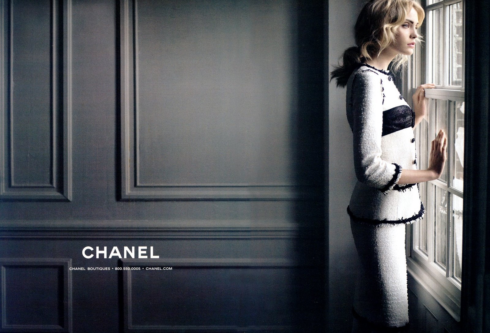
The Chanel ads are more feminine because it is apparent from its history background. Its original designer, Coco Chanel has freed women from inferiority and now women can walk the step as men. If you observe closely through the ads, they are actually more women being portrayed than men. Compare to the Dolce&Gabbana ads, the women are never being presented in an awkward manner like what we see in the Dolce&Gabbana ads. The women are always posed upright, independent, beautiful, free-spirited and elegant at the same time. It fits the whole concept of Chanel. The ads clearly shows that women nowadays can do things that they want to do and they could have jobs and life that they never once had. One of the ads shows Nicole Kidman in a black and white suit all shriveled up but she still laugh and feeling somewhat energetic emphasizing the fact that she has been successful in her life as an actress and she did it all by her hard work.

To conclude, the signifier of the ads are what the ads are showing such as how the products are being presented and the signified is how we interpret the representation of the ads about the products. Basically the signified depends on the readers because it is up to us how we think about the ads and my signified thoughts of the ads is that they represent the existence of the brands meaning my knowledge of their history, designers and their reputation conclude my interpretations.

References:
Lecture 6 slideshows

Wednesday, 1 September 2010

Semiotics: Video (Wk 3)

This is a video I found in Youtube and I think this is very useful for those of you who wanted to recall back what semiotic is. It is very simple and easy to understand. Enjoy!

Semiotics: Chanel vs Dolce&Gabbana (Wk 3)

Semiotics is the study of sign which is useful when you want to analyse the meaning of texts. Semiotics is derived from the work of Ferdinand de Saussure. It is a useful approach for you who wants to analyse visual texts. One way to use this semiotic approach is using advertisements. Advertisements had been using various ways in order to promote products or services. 

I have chosen Chanel and Dolce&Gabbana ads because they are one of the most popular ads seen worldwide and also exciting to be analysed.


These are ads from Chanel:


These are ads from Dolce&Gabbana:


After all of you seen these ads altogether, you probably wondering why I posts them in but I am sure you know why though. These ads came from two different designer brands and also being designated by a very different type of people. If you look closely you can differentiate between the two ads for example, the Chanel ads are more female orientated whereas Dolce&Gabbana ads are more male orientated so what does this conclude? 

Before we go deep into analysing these ads, we must know the background of these two brands. Chanel brand was created by the legendary couturier, Gabrielle Chanel who later adopted the name Coco Chanel when she became successful in her fashion career. She was the one who creates simple clothing for women during her days where women were forced to wear heavy materials for clothing and were strictly forbidden to wear small amount of fabric. 


The women in those days had to wear large amount of fabric put together so they look rather curvaceous and beautiful but in fact, the women were feeling nothing less comfortable and this angered Coco Chanel. She started to become rebellious to the fact women should wear these nonsense so she decided to change that. She slowly made small dresses for herself, making the dress more loose-fitting, easy to wear and basically comfortable. 


She had gone against the convention of society and became a legend to the fashion industry. She had become an icon and a role model for women of all times. 

Dolce&Gabbana, on the other hand, are two Italian designers, Domenico Dolce and Steffano Gabbana who also have risen their fashion empire and became one of the successful brand in the world of fashion. 

Domenico Dolce and Steffano Gabbana
Dolce&Gabbana sells various kinds of luxury items such as watches, sunglasses and purses. They are more of making items that are more of to long-term trends than seasonal trends. Their designs are very modern yet very casual. 

These two big brands are known worldwide to be one of the most influential and popular fashion brands in the world.   Thus they have made millions of fashion ads and  have created various kinds of ad designs and models to be presented in their ads. Their ads are very distinctive in order to represent themselves to the world. 

But the BIG question for today is 'What is the difference between the Chanel ads and the Dolce&Gabbana ads?' The answer will be in the next post. 

References:
Images are all from google images

It's More Than Meets The Eye

Assalamualaikum and Good Day! :)

I would like to welcome everyone who is visiting my blog :) I am happy to say that I'm proud to be in this course. This is a project journal for Visual Communication. I do hope you enjoy and do comment on any posts I made. Really appreciated it :)


Template by:
Free Blog Templates